One of the latest features of Log Insight 4.0 is the ability to create a Gauge chart that can turn green, yellow, and red based on a static number you set. The following guide will show you how to create a gauge chart based on a search criteria of “Error” found.
-
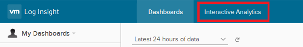
Login to Log Insight and click on Interactive Analytics
-
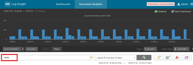
In the search bar, type in “error” and hit enter
-
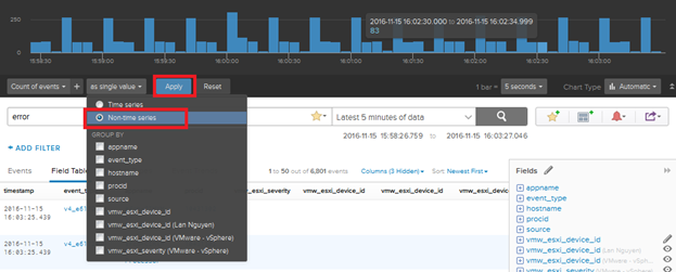
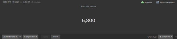
Hit the second dropdown to the top left and select Non-time series and click on Apply
-
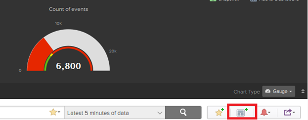
Notice how it now displays a total number
-
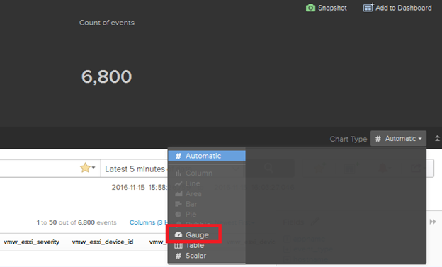
To change it to a Gauge chart we will have to switch the Chart Type from Automatic to Gauge
-
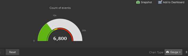
Notice how the chart now changes
-
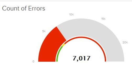
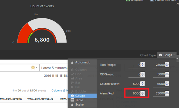
Now I want to set anything above 6000 events to show red instead of green. Hit the Gauge dropdown and add red as a value of 6000 as shown. Notice how the chart now changes red because the threshold of 6000 and above has been met.
-
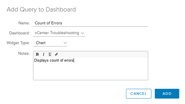
To add it to a dashboard, click on the
 icon
icon
-
Fill in a display name and make sure Widget Type is set to Chart
-
You can now view it on your dashboard